Marketing
Design a promotional brochure for Pagan Pride LA/OC.
Open Heart Grove Project CUUPS Project
Two members of the Open Heart Grove CUUPs leadership team contacted me, Jenny, and Gail to discuss the design of their group’s brochure. The group was getting ready to attend Pagan Pride LA/OC in October and needed a promotional brochure for the event. In the meeting, I gathered information about the group’s mission, core values, and bylaws. Jenny brought to the meeting as an example, the brochure of the Covenant of Unitarian Universalist Pagans (CUUPS) National which I looked over. I made comments around the wordiness of the brochure and suggested that they focus on a specific message to avoid overwhelming the reader. I explained that the average attention span for adults is 40 seconds, so in 35 seconds, what do you want the reader to know about your group?
The Goal
Create a promotional brochure for the group.
Low Fidelity Wireframe
After reading the group’s mission, core values, and bylaws, I presented the clients with a low-fidelity wireframe for the brochure. A trifold offers six panels of content for: (1) introduction, (2) mission, (3) community, (4) diversity, (5) what the group offers, and (6) a call-to-action. The clients liked the low-fidelity wireframe, however, Jenny requested that the logo of CUUPS National, which they are a chapter of, are visible in the brochure. According to CUUPS National logo policy the name of the chapter is placed underneath the logo in Garamond font and permission must be granted by the Communications Committee of CUUPS for a limited time only. I suggested it was best for the group to create their own logo and include the CUUPS name in the logo, since they are a registered chapter. In addition, we discussed high resolution photos which make the brochure look professional. We reviewed typeface style, the clients selected Glacial Indifference for the body and subheading, and League Spartan for the heading. We went over color scheme; they selected an earth tone given that they are an earth centered group.
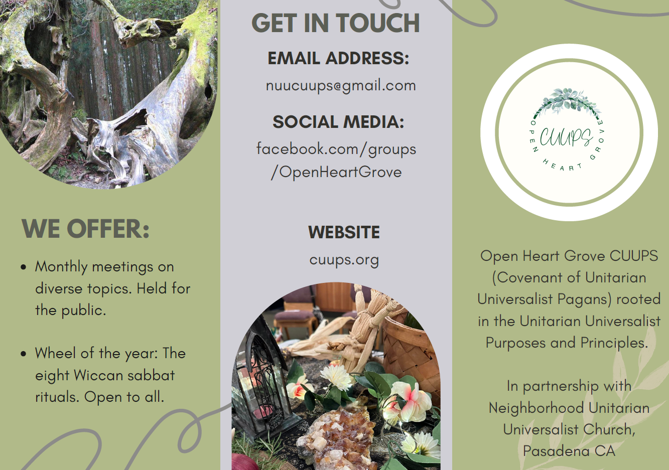
Final Redesign
CLICK on IMAGE for description of final redesign.
Feedback
The clients were happy with the outcome of the brochure. They felt that the brochure described the group and effectively captured its mission, core values, and essence.
CLICK on IMAGE
Skills
Recognize and understand the ways in which genres shape communication.
Understand the importance of user centered design.
Demonstrate ability to use a range of technologies for writing, editing, and designing.
Demonstrate a critical perspective of technology, its uses, users, and contexts.