UX Design
Write an internal document to ensure consistency across the whole team.
UX Document
The interdisciplinary Supervisors requested that I develop two user guides—one for onboarding new ED Community Health Workers and another for the interdisciplinary medical team—to standardize workflows, support consistent onboarding, and strengthen cross‑team alignment. Because the interdisciplinary team had experienced multiple staff transitions, a clear, standardized, and easy‑to‑follow process was essential to maintain continuity and ensure consistent care delivery.
The first UX document is a step‑by‑step walkthrough that guides new users through their initial login and navigation of Epic, the Electronic Health Record system used at Providence Hospital.
The prototype guide was usability‑tested with two Community Health Workers, one RN Case Manager, and one Social Worker, who were asked to follow it step‑by‑step to evaluate clarity, ease of use, and overall workflow.
Revisions to the prototype guide were informed by direct observations during usability testing and detailed feedback from testers. The guide underwent two additional test cycles and iterative updates before being presented to the interdisciplinary Supervisors.
Similarly, the second usability guide for the interdisciplinary team underwent three rounds of testing and iterative refinement before being presented to the Supervisors. This guide was designed to clearly communicate the role of the Community Health Worker, standardize workflow, and enhance cross-team alignment.
The user guides were formally adopted by both the Community Health team and the interdisciplinary medical team, becoming part of their standardized procedure and onboarding processes.
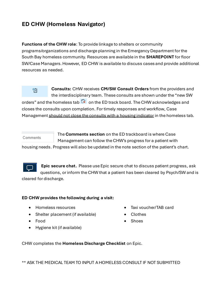
New Hire: Community Health Workers
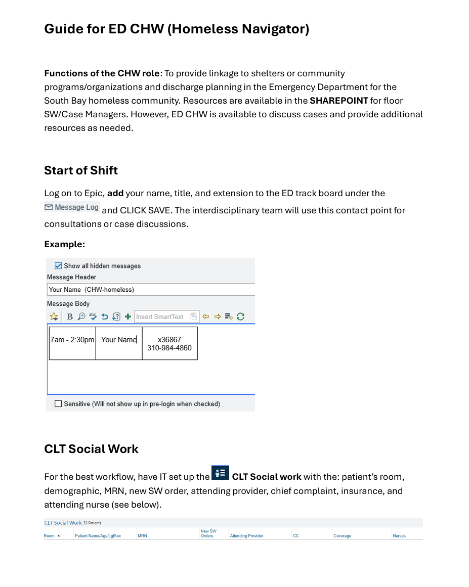
CLICK on IMAGE
Workflow: Interdisciplinary Team
CLICK on IMAGE
UX Design
Redesign the eCommerce website with clear functionality for the consumer.
Sol Poppy Healing Project 1
The client was the owner of Sol Poppy Healing LLC. who hired me for a for a freelance UX redesign of her eCommerce website. The owner created the website on Wix, and although aesthetically pleasing she wanted a shop page that was easy to navigate for the consumers. At the moment, the entire shop is on the home page, and it seems confusing and disorganized. In addition, the shop page makes it difficult for customers to find certain products. The owner is afraid that the shop, as it is, could decrease sales and earnings.
Goals for Redesign
Organize shop
User-friendly
Intuitive navigation
Navigation Bar
Low Fidelity Wireframe
In the second meeting, I presented the client with three low fidelity wireframes which will increase usability and navigation on the website. While doing research on the online shop, I discovered there are 413 products ranging from crystals to candles. However, this is not visible since the online shop lacks organization. I made three suggestions to the client: (1) create a product category in the homepage for easy navigation and little it shop, (2) include the most popular categories in the navigation bar, and (3) remove the shop from the navigation menu. The client was happy with the suggestions, however, requested that I not remove the shop link on the navigation bar. The client was afraid that the customer would miss the queues on the homepage. I explained to the client that key words, such as shop, will guide the consumer. However, the client was insistent that she wanted to keep it. Although I did not agree as I believed having two shops on the website would create confusion, I respected the client’s wishes. I encouraged her to keep an eye on her analytics, specifically the engagement page which shows the sections of the site the audience is engaging with.
The homepage now has a featured product section that displays items sold in the ecommerce site. Each featured product contains an image and label of the merchandise to make the category easy to identify for the audience. For example, the featured product crystal & Stone has a picture of a crystal and is labeled “crystal & stone.” This lets the user know that the featured product is for the category crystal & stone.
Once the consumer clicks on the featured product the product page appears. The product page is where the end-user will find all items under the same result. For example, all tarot & oracle decks will appear on the same page. The product page features a header along with images of the item, information of the product, price, and add to cart.
The user often looks to the navigation bar for aid and to access information on a site. The navigation bar links to the most popular items:
Candle
Cleanse & protection
Crystal
Jewelry
Tarot & oracle deck
Apothecary
Services
The navigation bar features high functionality and usability. For instance, all items that fit under the category cleanse & protect are in a drop-down menu.
Final Redesign
CLICK on IMAGE for description of final redesign.
Feedback
The client’s expressed that she was happy with the result and her goals were meet. The client’s top priority was the organization of the ecommerce website. The featured products on the homepage have clear labels and images of the merchandise. The featured products are linked to the product page, and the most popular items are on the navigation bar for easy access. The client felt the redesign focuses on the users and their shopping experience.
CLICK on IMAGE
Skills
Understand the importance of user-centered design.
Analyze, articulate, and respond to the needs of specific audiences and communication situations.
Demonstrate a critical perspective of technology, its uses, users, and contexts.
Demonstrate ability to use a range of technologies for writing, editing, and designing.
UX Design
Create a visually appealing and user-friendly digital media for the user.
Blog Series
The objective was to find a company to create a blog series and social media post about while keeping in mind its competitors. The blog series created was consistent with the organization’s purpose, voice, and intended audience.
The chosen company for this project was Chewy. Extensive research was conducted on Chewy as a company and brand for topics related to the blog series. A look at their sales metrics from previous years helped narrow the focus.
The research provided insights on the company’s top sales which included puppy, birthday, and senior items. The blog series celebrates milestones and encourages consumers to celebrate every life stage with their dog.
The first blog is about preparing for the arrival of a new puppy. The second is about celebrating your dog’s birthday, and the third is about how to care for your senior dog. Design principles such as chucking, and layering were used for easy readability and to tell a story.
The blogs layout was designed with eye-catching phrases and visual designs such as headers, sub-headings, and quotes to get the reader’s attention, and prompt them to continue reading. The audience’s interest was captured through creative titles, pictures, and language that conveyed emotion.
The writing voice and the information the audience was seeking was considered in the blog series. In addition, items sold by Chewy were hyperlinked for quick access. The social media post invited the intended audience to read the blog.

CLICK on IMAGE
Skills
Recognize and understand the ways in which genres shape communication.
Understand the importance of user-centered design.
Analyze, articulate, and respond to the needs of specific audiences and communication situations.
Apply conversations of genre and form appropriate to specific audiences and context.